✔︎ Last updated on September 29th, 2022
In this article, I will explain (step by step) how you can make the radar scanner animation in CSS without using any JavaScript.
At the end of this tutorial, I have also added a Codepen block with complete code so that you can play around with it.
I strongly suggest you open a new Codepen and follow along with this tutorial.
Let’s begin.
Set up the stage
In the animation above, we have 4 elements –
- Green scanner
- Outer circle (with a shadow)
- Two waves that ripple out from the outer circle
This will be my HTML code for this project.
<div class="outer-circle">
	<div class="green-scanner"></div>
</div>
You should notice that I haven’t created any HTML element to represent the two waves. That’s because I will use pseudo-elements for this purpose.
Now let’s come to the CSS part.
Design the Outer Circle
Let’s style the outer circle first. I will apply the following properties to it –
- Set its
widthandheightequal to240px(Equal because it will become a circle). - Give it a
border-radiusof50%(to make it a perfect circle). - Give it a
box-shadowso that it doesn’t look flat on the page. A little shadow will give it a 3-d look.
Here’s my CSS code for the .outer-circle –
.outer-circle {
    /* 	design the circle */
    width: 240px;
    height: 240px;
    border-radius: 50%;
    box-shadow: 0 0 8px 0 #aaa;
}
And here’s my output –

Design the Inner Green-scanner
Now let’s design the .green-scanner element. I will apply the following styles to this element —
- I will give it equal
widthandheightof200px(which is40pxsmaller than its parent.outer-circle). - I will give it a
border-radiusof50%. - I will paint its
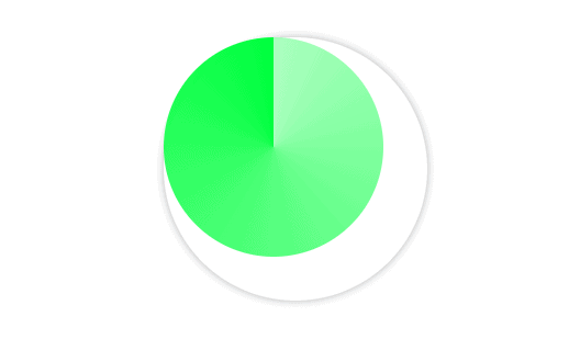
backgroundusingconic-gradient.
Here’s our code for .green-scanner element –
.green-scanner {
    width: 200px;
    height: 200px;
    border-radius: 50%;
    background: conic-gradient(#00ff0055, #00ff00);
}
And here’s our output —

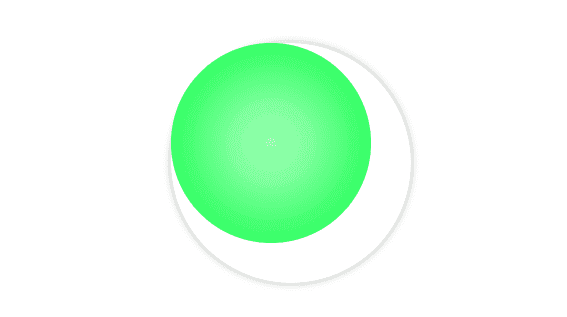
I have chosen conic-gradient function because it paints the background in a circular fashion (as if sweeping from a center point). Had we chosen radial-gradient, we would have gotten this —

It’s clear that radial-gradient doesn’t give us that radar scanning effect we are after.
With the discussion on background out of the way, let’s remedy the obvious problem here — the outer and inner (green) circle are not concentric.
Let’s use some CSS to make them concentric.
Make circles concentric
As the outer circle is 40px bigger than the green circle in width and height, all we need to center the green circle is shift it to the right and down by 20px. We can do that by writing the following lines of code —
.green-scanner {
    /* write code so far here */
    position: absolute;
    top: 20px;
    left: 20px;
}
Also, remember that to position an element as absolute, we must position its parent something other than static otherwise, the child element will be positioned relative to the body.
So, I am giving the .outer-circle position of relative.
.outer-circle {
    /* write code so far here */

    position: relative;
}
Here’s the output —

Better!
Now, we need two more elements that will work as waves that ripple out of this scanner.
Creating the Waves
We could have used two more HTML divs but that is not considered semantic — using HTML elements only for styling purposes.
Luckily for us, almost every element in CSS ships with two pseudo-elements (that work as its child elements). They are not present in the HTML markup but you can use them using ::before and ::after pseudo-selectors.
In styling these elements, we want the following —
- they should perfectly overlap with the outer circle (because they are rippling out from there)
The following code should suffice —
.outer-circle::before,
.outer-circle::after {

    /* must have! Pseudo-elements don't appear if the content property is not declared */
    content: "";

    /* set dimensions equal to their parent */
    width: 100%;
    height: 100%;
    border-radius: 50%; /* make it a circle */;
    border: 1px solid #eee;

    /* perfectly overlap them with their parent */
    position: absolute;
}
Our final output looks like this —

You cannot see the ::before and ::after pseudo-elements but they are there, overlapped on the outer circle.
Now it’s time to animate the entire thing.
Apply Animation
Now, all there remains is to write our keyframe definitions and animation properties.
For the green circle, we want it to rotate continuously. We can do that using the following lines of code —
.green-scanner {
    /* write code so far here */

    animation: scan 4s infinite linear;
}

@keyframes scan {
    to {
	transform: rotate(1turn);
    }
}
And for the ripples, we just have to scale them up.
.outer-circle::before,
.outer-circle::after {
    /* write code so far here */

    animation: ripple 2s infinite linear;
}

@keyframes ripple {
    to {
	transform: scale(2.5);
    }
}
Our animation looks like this —
You will observe that there is only one “ripple” visible in the animation.
Well, actually, both the ripples are present here but, as they are overlapping each other, they appear as one.
We need to apply animation-delay on one of the waves so that it ripples out after the first.
.outer-circle::after {
    animation-delay: 1s;
}
Our final output looks like this —
See the Pen Radar Scanning Effect by Gauri Shanker (@Gsbansal) on CodePen.
Much better!
That brings this tutorial to the conclusion.
I hope you found this article useful. If you did, please share it with your friends.
If you have any different approach or any improvement in this article, kindly drop a line in the comments.