✔︎ Last updated on September 29th, 2022
In this article, I will show you (step-by-step) how you can create a power button effect in CSS without using any JavaScript.
At the end of the article, I have also included a Codepen so that you can see my full code in action.
I strongly suggest you follow along with this tutorial. Click here to open a new pen in a new tab.
Let’s begin.
Basic Setup
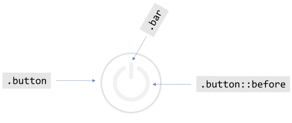
In this power button, there are three elements —
- The outer ring, which is a
divwith class ofbutton - Inner ring, which is a pseudo-element i.e.
.button::before - A vertical bar, which is a
divwith the class ofbar
So, this is our entire HTML code for this project —
<div class="button">
    <div class="bar"></div>
</div>
Now, let’s style these elements using CSS.
Design the outer ring
I will first design the button (outer ring). In designing this ring, I want the following —
- It should be a circle
- It should have a shadow (to give it a 3-d effect)
This will be our CSS code for this purpose —
.button {
    /* 	design the outer circle */
    width: 150px;
    height: 150px;
    border-radius: 50%;
    border: 1px solid #ddd;
    box-shadow: 0 0 5px 0px #888;
}
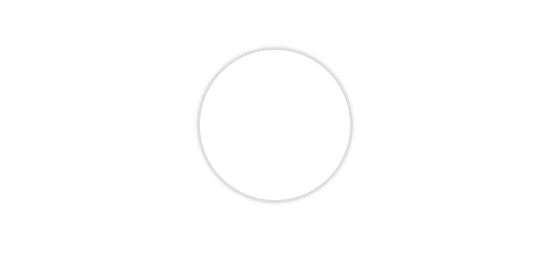
This is our output —
Design the inner ring
Now, let’s style the inner ring (.button::before) element. I want this ring to have the following properties —
- It should have half the size of its parent i.e. half the
widthandheightof the.buttonelement. - It should be a circle.
- It should be concentric with the outer ring.
- It should have a
borderof10px.
This will be my code —
.button::before {
    /* pseudo-elements don't appear unless content property is declared */
    content: "";

    /* design the element */
    width: 50%;
    height: 50%;
    border-radius: 50%;
    border: 10px solid #eee;
}
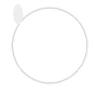
And this is our output —
Uh-oh!
Do you see a grey-colored smudge on the top-left side of this circle? That’s our .button::before element. But why is it only a blob when we have explicitly set a width and height of 50% on it?
That’s because, by default, pseudo-elements occupy only the space required by their contents. Even if you set their width and height in pixels, they take up only the space required.
To explicitly set the
widthandheightof pseudo-elements, we must set theirpositionasabsolute.
Let’s do that —
.button::before {
    /* write code so far here */

    position: absolute;
}
This is our output —
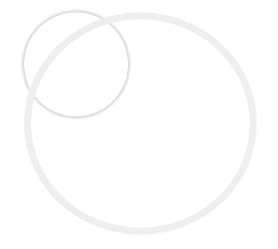
Ahem! We succeeded in setting the size but there is a problem. When we defined its width and height as 50%, we didn’t tell the browser 50% of what!
By default, when we don’t tell the browser relative to what, it makes the body element as the reference point.
So, the size of this pseudo-element is set by the browser at 50% of the body. We don’t want that.
We want it to have a size of 50% relative to its parent i.e. .button element. So we must set position:relative on .button element.
.button {
    /* write code so far here */

    position: relative;
}
This is our output —
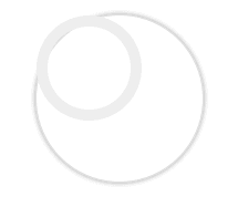
Much better. But do you see the problem?
It’s not concentric with the outer ring (.button element).
We can fix that by using a simple hack using the grid. On the parent .button element, we can define these two properties —
.button {
    /* write code so far here */

    /* center the child elements */
    display: grid;
    place-items: center;
}
Now, let’s focus on the vertical bar element.
Design the vertical bar
I have written the following code to style the .bar element —
.bar {
    height: 30%;
    width: 10px;
    background: #eee;
    border-radius: 10px; /* for rounded ends */
}
This is our output —

Let’s shift this element up a little bit.
.bar {
    /* write code so far here */

    position: absolute;
    top: 20px;
}
There’s only one thing left to do. We have to make an opening in the inner ring.
We can do that by giving a white colored box-shadow to the .bar element.
.bar {
    /* write code so far here */

    box-shadow: 0 0 0 10px white;
}
Great. Now that we have positioned elements where they have to be, let’s add some interactivity to them.
Right now, when I hover this button, it doesn’t give any feedback to the user. It doesn’t let the user know that the button is clickable.
Let’s change our cursor to a pointer whenever we hover the .button element.
.button:hover {
    cursor: pointer;
}
Next, when I click on the button, I want the following —
- The shadow that sits outside the
.buttonshould be setinset(to make it look like it is being pressed). - Both the inner elements (ring and the bar) should light up green.
The following lines of code can help me achieve that —
.button:active {
    box-shadow: 0 0 10px 0px #888 inset;
}

.button:active .bar {
    background: lightgreen;
}

.button:active::before {
    border-color: lightgreen;
}
This is our output —

Here’s the codepen block for you to see the entire code (and fork it to improve) —
See the Pen Power-button in Pure CSS by Gauri Shanker (@Gsbansal) on CodePen.
I hope you liked this tutorial. If you did, please share it with your friends on Twitter and Facebook.
Did I miss something or would you do something different in this tutorial? Please drop a line below and let me know.
You might also like these posts —